Small businesses collect more marketing data than ever. Advertising platforms report clicks and conversions. Websites record visits and behavior. Email tools track engagement. Sales systems capture leads and revenue.
Yet more data does not automatically create more clarity. When reporting is crowded, disconnected, or built around the wrong metrics, important decisions become harder instead of easier.
A chart should answer a business question
The value of a marketing chart is not the design alone. It is the question the chart helps answer.
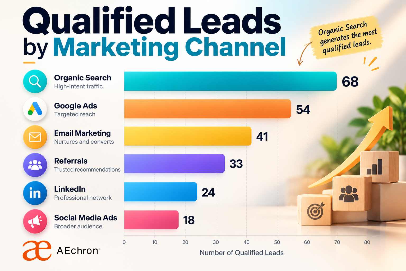
Which channel is producing qualified leads? Is campaign performance improving over time? Are higher advertising costs creating better customers? Where are people leaving the path between the first click and the final sale?
When the question is unclear, the chart often becomes a collection of numbers without a useful conclusion.
Attractive reporting can still be misleading
A polished visual can create confidence even when the underlying comparison is weak. Missing context, inconsistent date ranges, incomplete tracking, and poorly defined conversions can all produce an impressive chart that supports the wrong conclusion.
This matters because charts influence budget decisions. A business may reduce spending on a valuable channel, increase spending on low-quality traffic, or overlook a problem in the customer journey simply because the reporting focused on the easiest number to display.
Clicks are not the final outcome
Clicks and impressions can help diagnose campaign activity, but they do not explain whether the business received qualified inquiries, booked appointments, completed purchases, or profitable customers.
Useful reporting connects campaign activity to what happened afterward. That includes the landing page, lead quality, follow-up process, sales outcome, and customer value. AEchron's analytics and reporting services are designed around this broader view.
Different audiences need different views
A campaign manager may need detailed information about targeting, creative, and cost. A business owner may need a concise view of leads, sales, and return. A client presentation may need a visual summary that explains the result without requiring the reader to interpret a complex dashboard.
Trying to serve every audience with the same report usually creates unnecessary complexity. Strong reporting gives each reader enough information to understand the decision in front of them.
AI can accelerate the visual work
AI can help organize information, identify patterns, and reduce the time required to prepare visual reports. It can also make it easier for smaller teams to communicate data without relying on a large analytics department.
But automation does not replace judgment. Someone still needs to confirm that the data is accurate, the comparison is fair, the language is honest, and the visual supports the intended business question.
Clarity creates better conversations
A clear chart makes it easier to discuss what is working, what needs attention, and what should happen next. It can turn a long performance report into a focused conversation about budget, creative direction, website improvements, lead quality, or campaign strategy.
The goal is not to produce more charts. It is to make important information easier to understand and act on.
Better reporting starts before the design
The strongest visual report begins with clear goals, reliable tracking, consistent definitions, and a connection between marketing activity and business outcomes. Design then gives that information structure and emphasis.
When those foundations are missing, another dashboard only adds another layer. When they are present, even a simple visual can reveal what the business needs to know.
Create clearer marketing charts with AI
Marketing Charts Made Simple is a practical 14-page guide with a complete creation process, reusable prompts, a worked example, planning worksheet, chart templates, and direct links to chart-making tools.
Get the digital guide →